How do I fill pages?
Content
Content
- Fields: Fields allow you to fill content that appears once on the page. For example, the title of the page or an introductory text.
- Containers: In containers, you can fill content that can occur multiple times. For example, think of multiple paragraphs of text or images. In this section you can read more about adding container components.
The title field
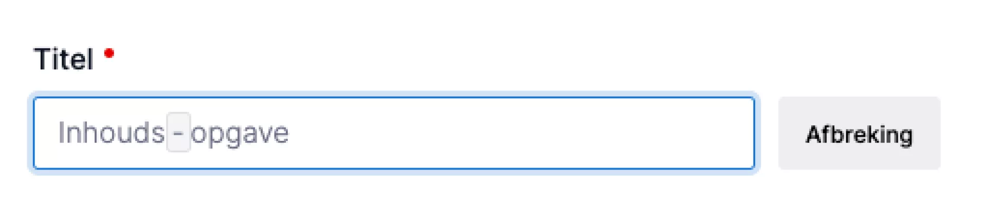
The title can be broken down by syllables so that the word can be made to fit in all browsers and for all resolutions. This is particularly useful to prevent long words from running out of focus. Place your cursor where you want to hyphenate the word and then press the "Hyphenate" button. You will then see a grey framed line. By default, this line is not shown at the frontend unless the word needs to be hyphenated. The browser will then do this at the indicated places. It is advisable to add these characters between the syllables.
Do you not yet have this option in your CMS? Then contact our support department to find out what the options are for adding this feature in your installation.
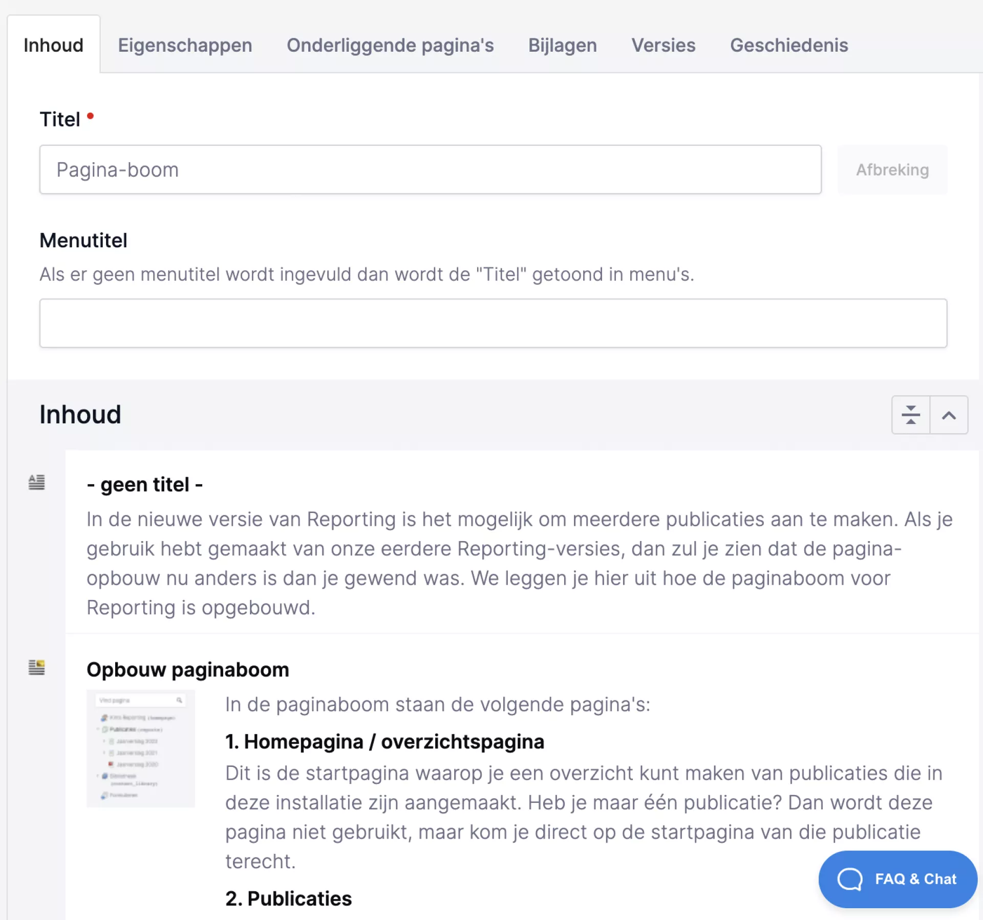
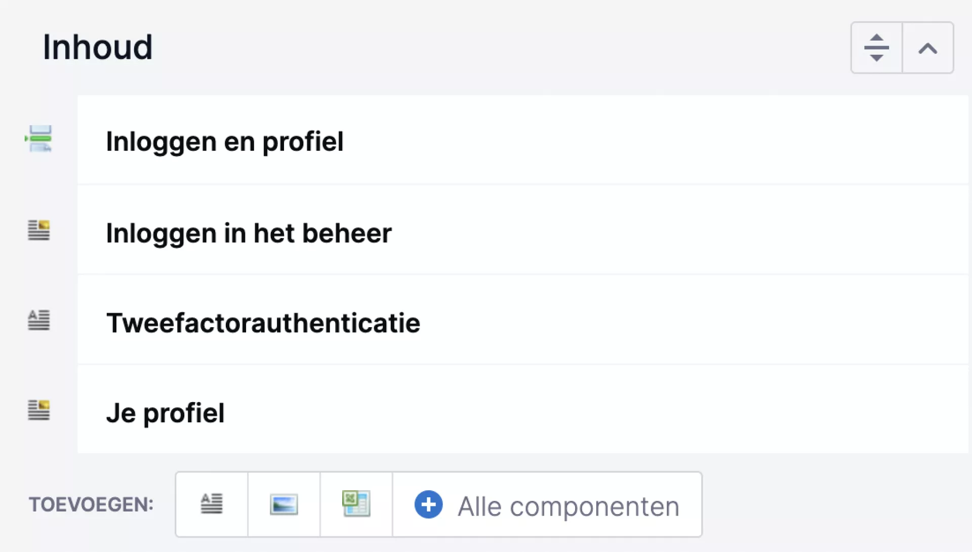
Containers
Every page in the CMS is divided into one or more containers. A container distinguishes a part of the page (for example, a container "Content", "Introduction" or "Right column"). You can add your own components in these containers. The containers containing components together form the representation of your web page. You recognise them by the light grey bar with a title.
A container contains components. Read more about how components work below.
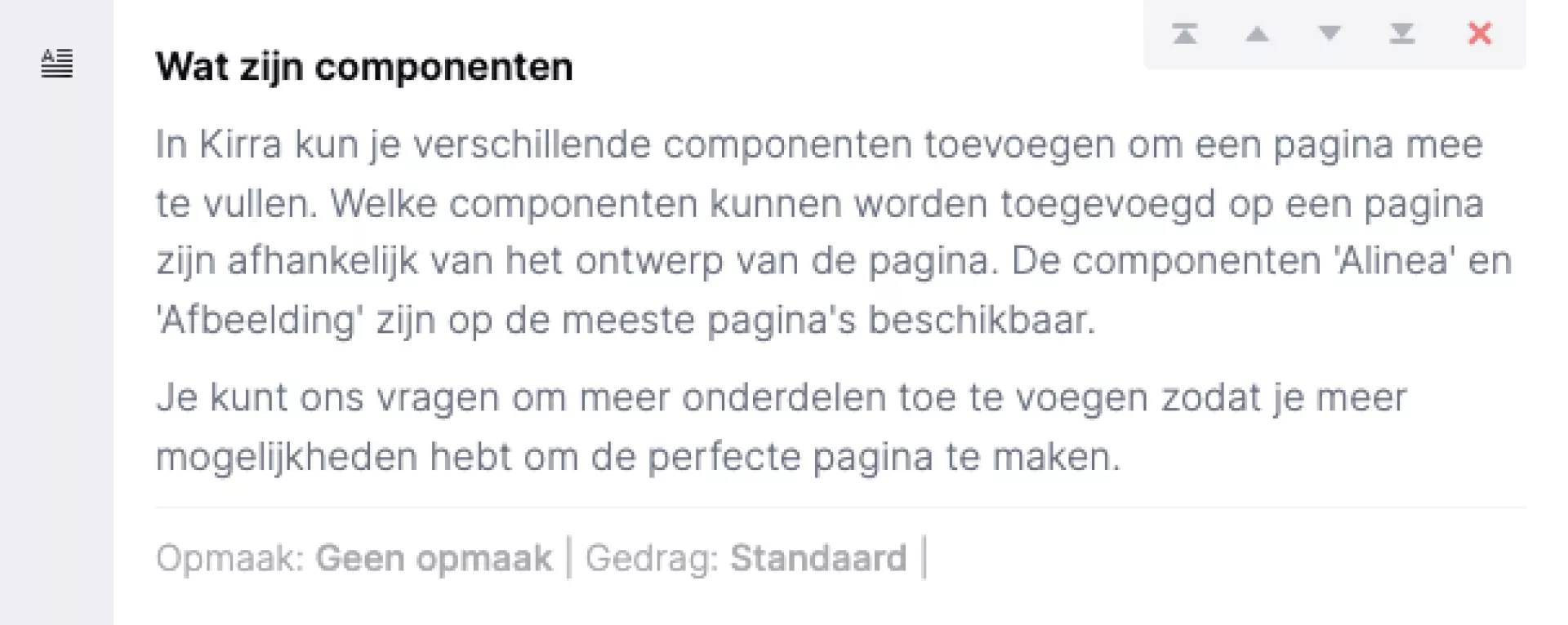
Components
In Kirra, you can add various components to fill a page. Which components can be added on a page depend on the design of the page. The components "Paragraph" and "Image" are available on most pages.
You can ask us to add more components to give you more options to create the perfect page.
Preview of a component
If you haven't clicked on a component yet, you will see a preview of the contents of that component.
Content of a component
Click on a component and you will see its contents. You fill the content of a component in the fields. The fields differ per component. For example, you often see fields to enter a title, text or a link. Sometimes there are also components with a container. Within these, you can then add components again. For example, as in a "List of links".
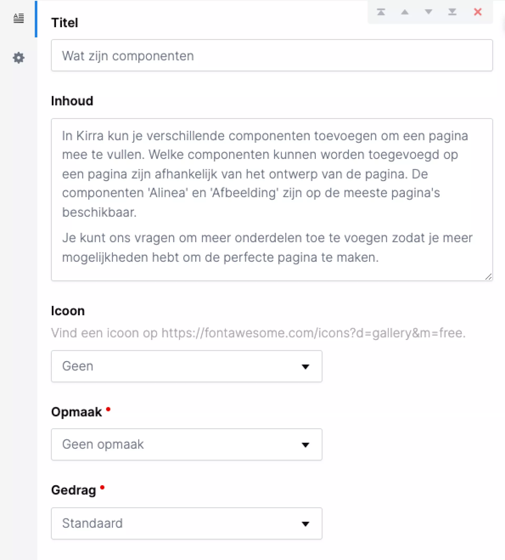
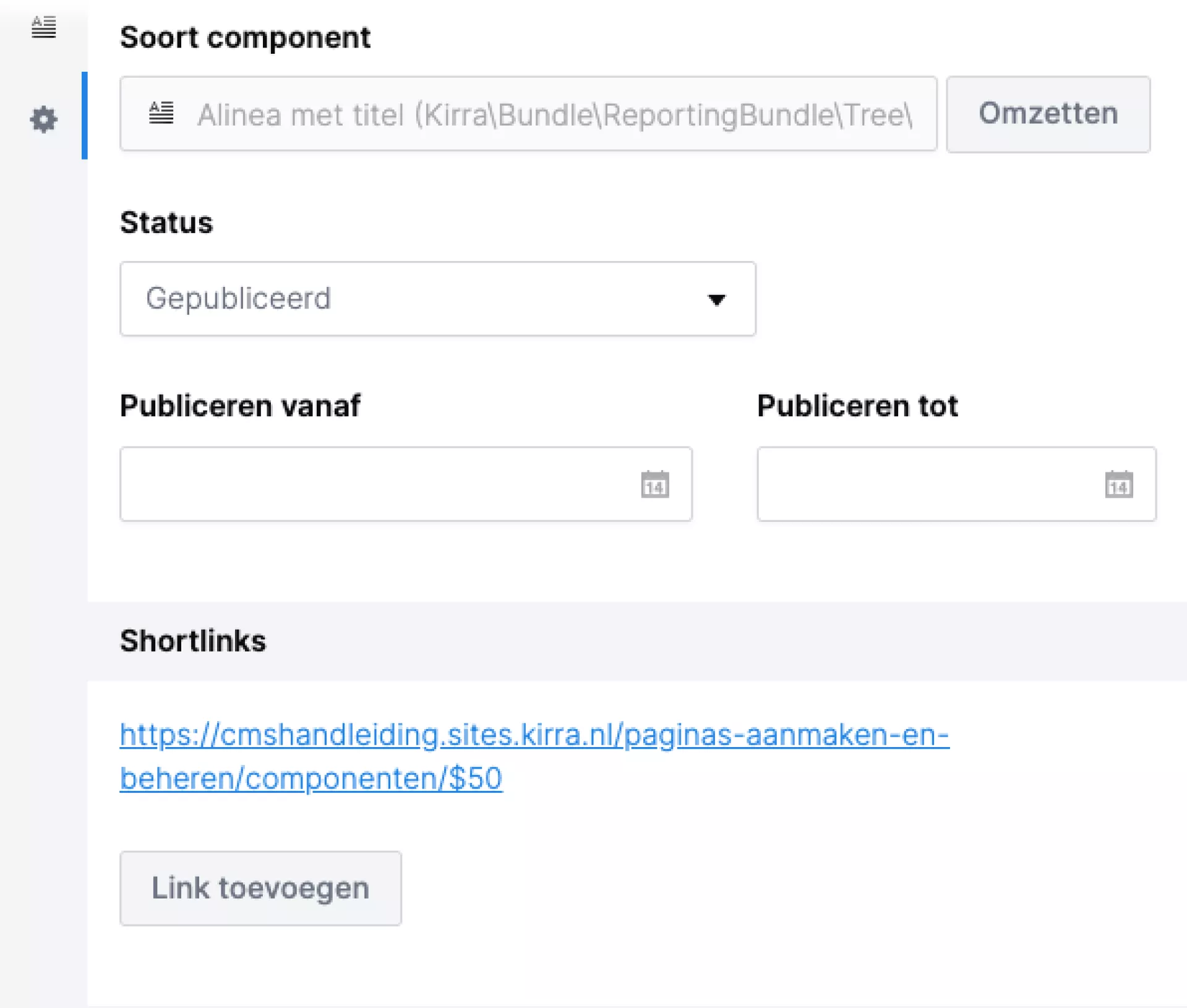
Properties of a component
Each component also has properties. These can be found under the cog icon. Here you can:
- Convert: Convert a component to another (similar) component. For example, a "Paragraph" to a "Featured paragraph". This option is not there for every component.
- Status: This works the same as for pages.
- Agendering: This works the same as with pages.
NB! Depending on your package, more properties are also possible for a container component.
Add component
You can add a container component in two ways.
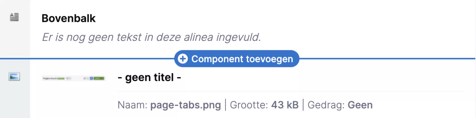
Bottom
At the bottom of each container you will find three buttons with the most commonly used components. Click one of these buttons to add the component directly at the bottom of your page.
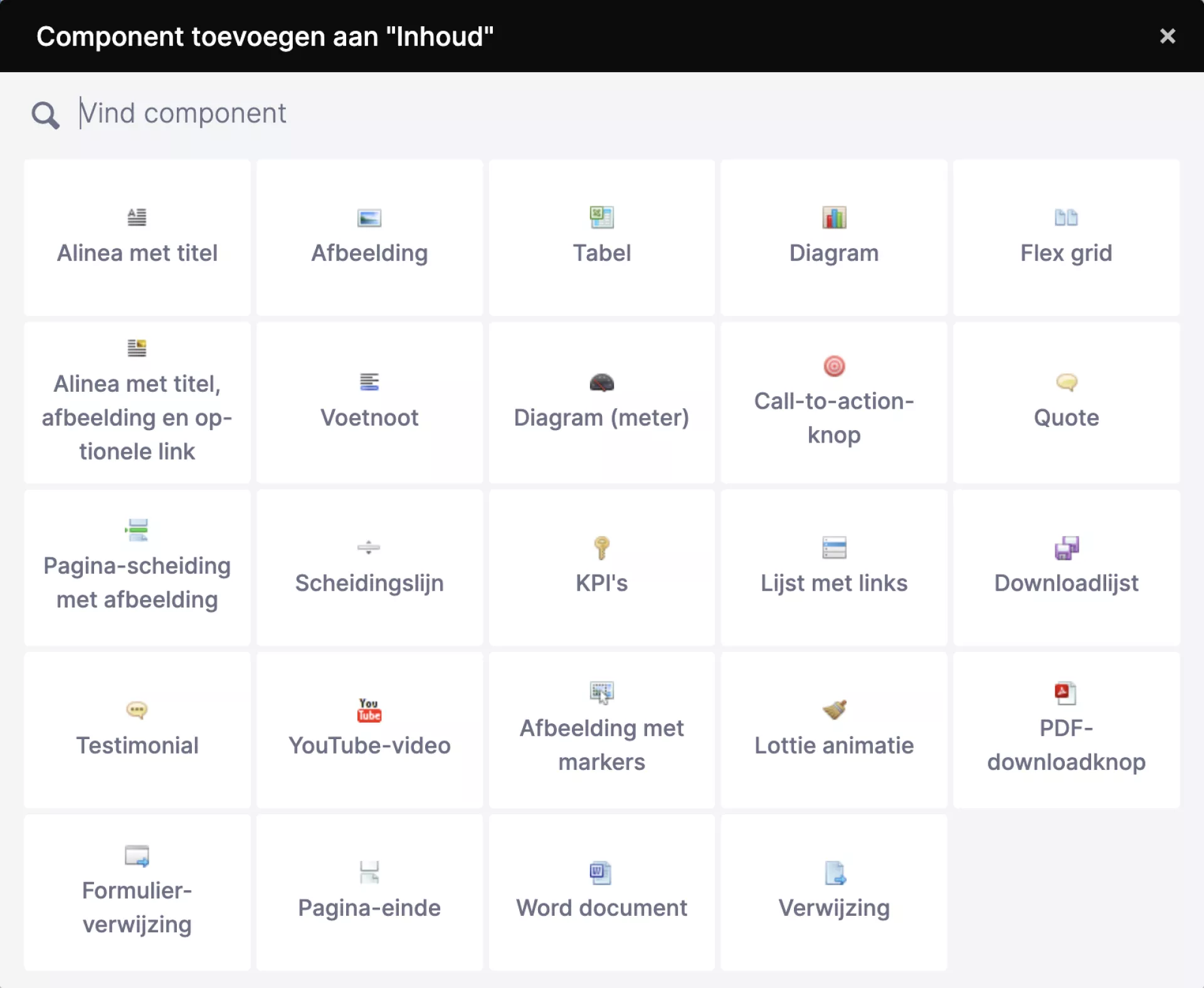
In addition, you will find another "All components" button that opens a window in which you can add one of the other components.
At any location
If you want to add a component among other components, click on the line with a plus icon. The same window then opens with an overview of all components. Click a component to add it, for example, halfway or at the top of your page.
Tip!
You can also search the window to find your components faster. In addition, you can also use the arrow keys to move through the list.

Move component
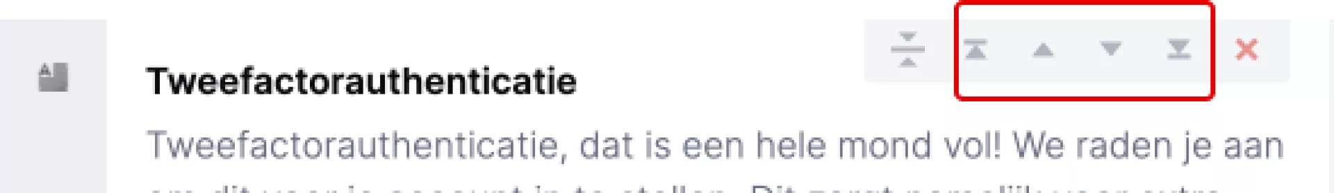
Moving components is easiest by dragging it with your mouse. You can drag a component up or down to move it to a different position on the page. You can also drag a component to another page in the tree. You will be asked whether you want to move or copy the component.
You can also use the arrows you see in the top right-hand corner of the component when you move the mouse over it. See also the screenshot opposite where exactly you can find these arrows.
Tips!
- You can get a better overview of the components in your container by resizing components. Click on the icon from the screenshot opposite. You will see that the container is then displayed a lot more compactly. Dragging components is now a lot faster.
- You can also resize one component by clicking on the same icon that is inside the component.

Move or copy component to another page
If you want to move or copy a component to another page, make sure the page where you want the component to go is visible in the page tree. Drag the component from the container to the tree and the pages where you can add the component will be highlighted.
If you release the component, a window will ask you whether you want to move or copy the component.
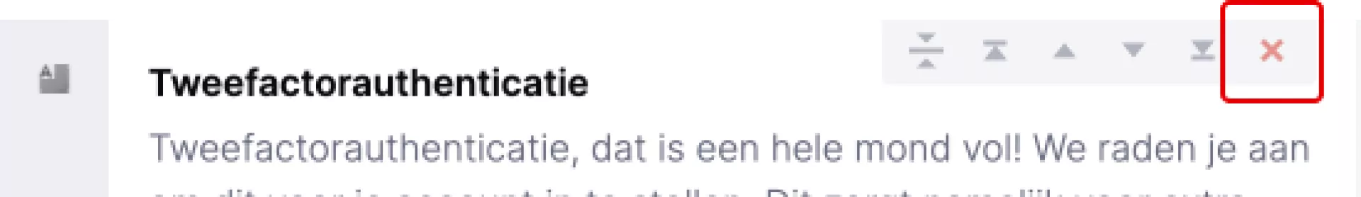
Remove component
Deleting a component works by clicking the cross on the top right of the component. After clicking it, you will be asked for confirmation, after which the component will be deleted.
Did you delete a component by mistake? Then you can restore a previously saved version of the page from the History tab.
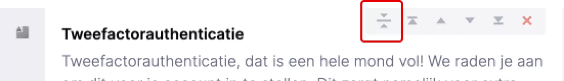
Reduce components
Do you have a component that takes up a lot of space? Then click on the icon from the screenshot opposite. You will then only see the title of the component. This way you create more overview in the CMS.
Features
Features
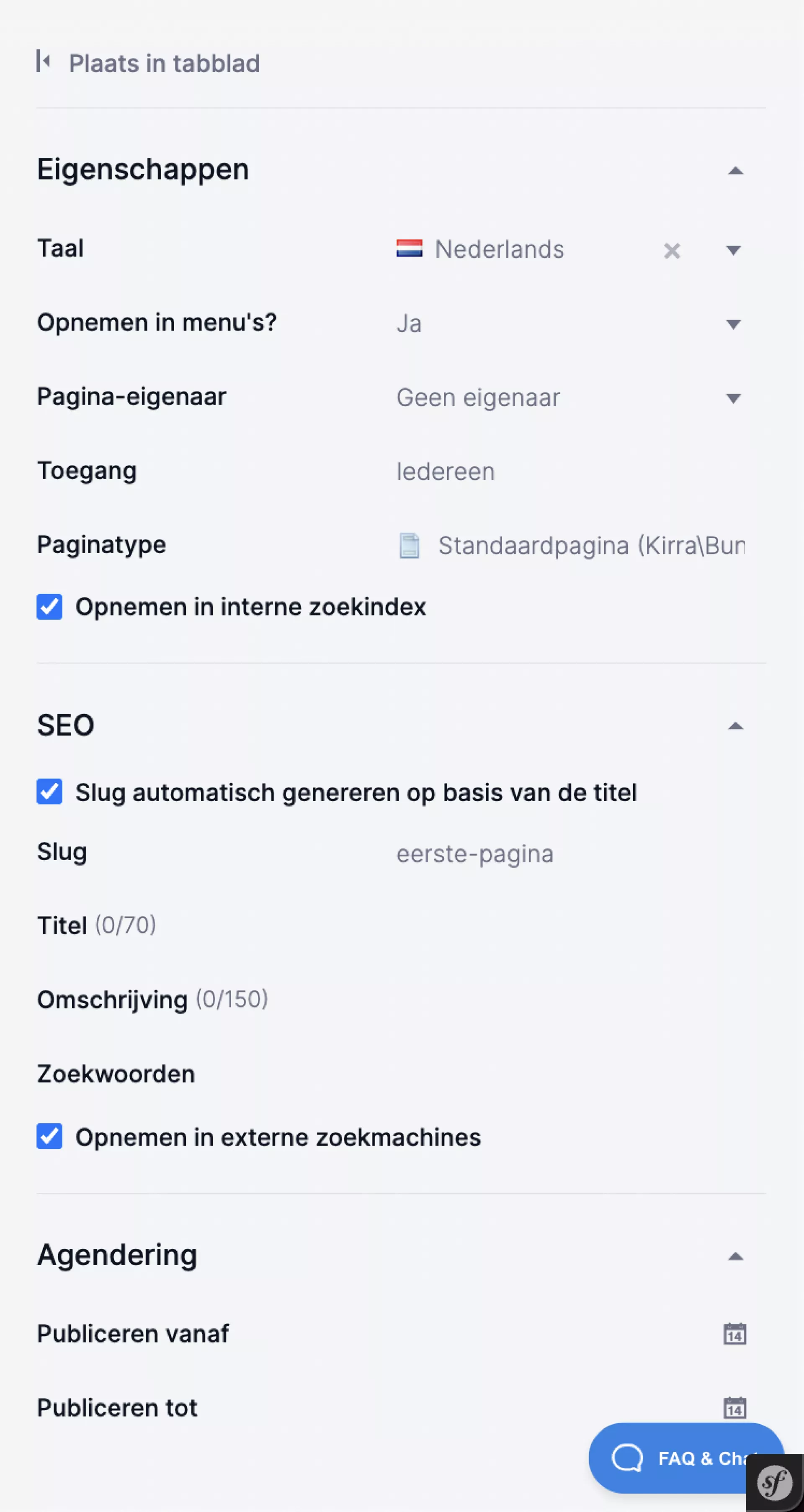
Under the "Properties" tab, you can set the various properties, namely:
- Properties: properties of the page
- SEO: Properties for the benefit of search engine optimisation
- Agendering: When the page is visible to visitors.
Tips!
- Depending on the size of the window you have the CMS opened in, you may also see the "Properties" displayed as a tab.
- If you have a screen with a minimum resolution of 1920 pixels, you have the option of showing the page's properties as a tab. This way, you create extra space to fill the content of your page. On smaller screens, the properties are always visible in the tab. To do this, click the "Place in tab" button at the top of the right-hand bar.
Page properties
Recording in menus
All pages you create are included in the menu by default. This option is set to "Yes" by default.
You may have a page with content for a select audience. You can then choose not to include the page in the menu, so that not every visitor can see this page. Visitors who know the url (e.g. because you include it in a newsletter) can then visit the page. In these cases, choose the dropdown menu under "Include in menus?" for "No".
Page owner
The owner of a page refers to the person responsible for its content. For example, in the page overview you can keep track of whether your pages are still up to date.
Page type
The CMS uses different page types, for example standard pages, news items, blog posts or calendar items. Custom page types may also have been added for your website. In the field "Page type" you can see which page type is used for this page. If you would have liked to use a different page type afterwards, you can change the page type.
Changing the page type works as follows:
- Click the "Convert" button behind the "page type" field.
- Click the arrow in the "convert to" field to display the menu containing the different page types.
- Select the desired page type and click "Save" at the top right. You now get the message "During the conversion of this component, data will be lost. This cannot be undone. Are you sure about this?" So also check beforehand that all the components you have used are also available within the other page type. If you are sure of this, click "Ok".
The page type has now been changed.
Note!
When you change a page type, all versions of the page change with it. Suppose version 1 was still a Standard page, you create a new version and convert it to a Flex page, then version 1 is also changed.
SEO
Slug
The slug is part of the URL. An example: on the iWink website, we have a page about our products. The slug of this page is "products". The URL is therefore https://www.iwink.nl/producten.
Standardly, the slug is generated automatically based on the page title. If you uncheck this, you can choose a slug yourself. When doing so, make sure that the slugs of any parent pages are also included. To stay with the example of the iWink website: the products page has an underlying page with the slug 'websites'. The full URL is therefore https://www.iwink.nl/producten/websites.
Title for SEO and Description
When you look something up on Google, in the list of search results you will see all kinds of 'previews', or short texts in which you can see what the page is about. By default, Google shows the title of the page and the first lines of text on that page here. If you want to show a different preview in Google, fill in the 'Title' and 'Description' fields in the CMS.
Keywords
The keywords you can enter here affect the internal search function of your own website. An external search engine like Google does nothing with it. If you enter these words, the internal search engine will link a high score to it. So this allows you to influence the position in the internal search engine.
Tips!
- Use this field for abbreviations, synonyms or known misspelled words. This way, the correct page will still be found if someone searches for a synonym or misspells the search term.
- also useful to know: the CMS searches from three characters by default to avoid illogical results (the, the, one). In doing so, an exception is made for this field. So do you have a term of three or fewer characters? Then enter it here to make the page findable on that term.
Inclusion in external/internal search engine
These two options are checked by default in the CMS. This means that when you create a page, it may be shown in the search results by search engines such as Google (external) and by the search function on the website itself (internal).
You may have created a page that is not intended for every visitor and therefore should not be shown in the search results. In that case, uncheck these options.
Agenda-setting
The "Scheduling" option allows you to specify whether the page should be visible on the website from a certain date (Publish from) or should no longer be shown after a certain date (Publish until). Useful if, for example, you want to set up a page on Friday that should be live immediately after the weekend. If you do not enter anything here, the page will be shown as soon as you click 'publish' and will remain visible until you set the page to "offline".
Note!
This function only ensures that a page is displayed during the set period, but does not adjust the actual status of the page in the CMS. So a page that has the status "offline" is not automatically published when you set a date. Only when a page has the status "published" does this function work.
Social media
The fields under "Social media" allow you to influence the display of the link preview on LinkedIn, Twitter and Facebook. By default, these social media show the title of the page, plus the first sentence and the first image. In the "Title", "Description" and "Image" fields, you can specify which title, description and image you want to show on social media.
Annexes
Annexes
You can add files to a page under the "Attachments" tab. These files will also be stored in media management. This feature is particularly useful when you want to be able to find files quickly when working on a page but do not want to show these files on the frontend of the website.
Versions
Versions
A page can always have one or more versions. For example, the same page can be available in the language versions Dutch, English and German (read: three versions of the same page).
But you can also create multiple versions within the same language. For example, if you want to restructure a page. In that case, you don't want your visitors to see your work-in-progress, so you can create a new version of it. The visitor continues to see the current version that was already published, while you can work on a new draft version. You can find the versions of a page on the "Versions" tab.
Nice to know: someone with the rights "editor" instead of "final editor" can only work with new versions of a page. This is because this person is not allowed to do anything that a visitor sees directly (including publishing a draft). Click here if you want to know more about these rights.
How do I create a new version of a page?
- Go to the page (and possibly language) you want to use as a base
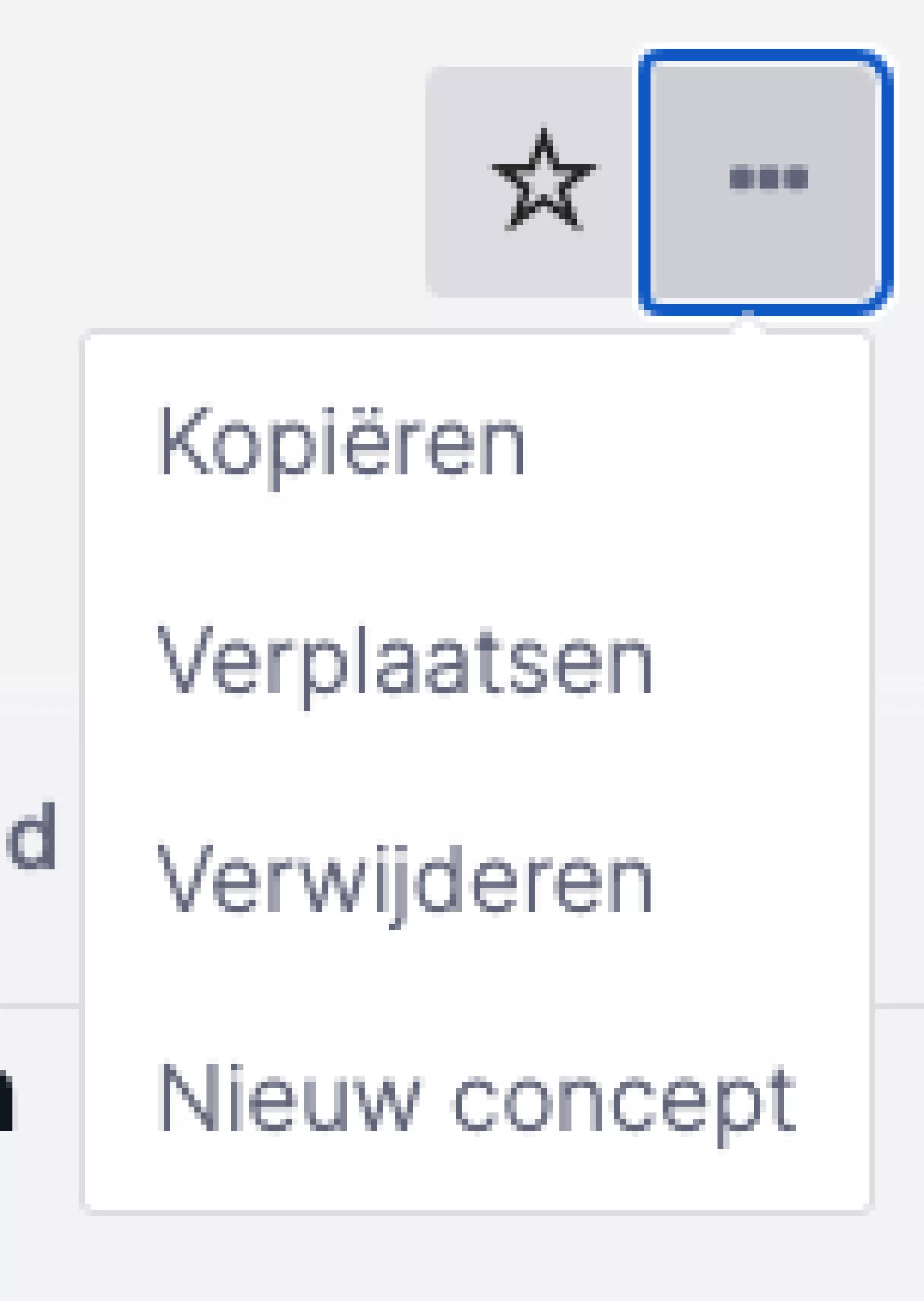
- Select the grey icon with the three dots in the action menu at the top right and choose "New draft"
- A new version of the page will be created
- You can now work here to your heart's content and preview it (blue eye icon in the action menu), while the visitor still sees the older content
- When you are done, choose "Save and publish" in the action menu under the drop-down menu of the green "Save" button.
- The visitor now sees your changes and the old version has automatically been given the status 'offline' (because, this version is now 'published')
If you have access to the "Languages" module, you can also create pages in another language. At the top of your page, you will see the Dutch flag. Click the down arrow and a new window pops up. Here you can search for other languages.
Note!
Want a page in English, including the flag of the United Kingdom? Then search for United Kingdom.
If you've created pages in another language, you'll naturally want your visitors to be able to choose that language. You can read how to set this up in the module "Languages".
History
History
Over time, you will make various changes to a page. All these changes are saved by the CMS and can be found under the 'History' tab. In the image below, you can see the history of this page:
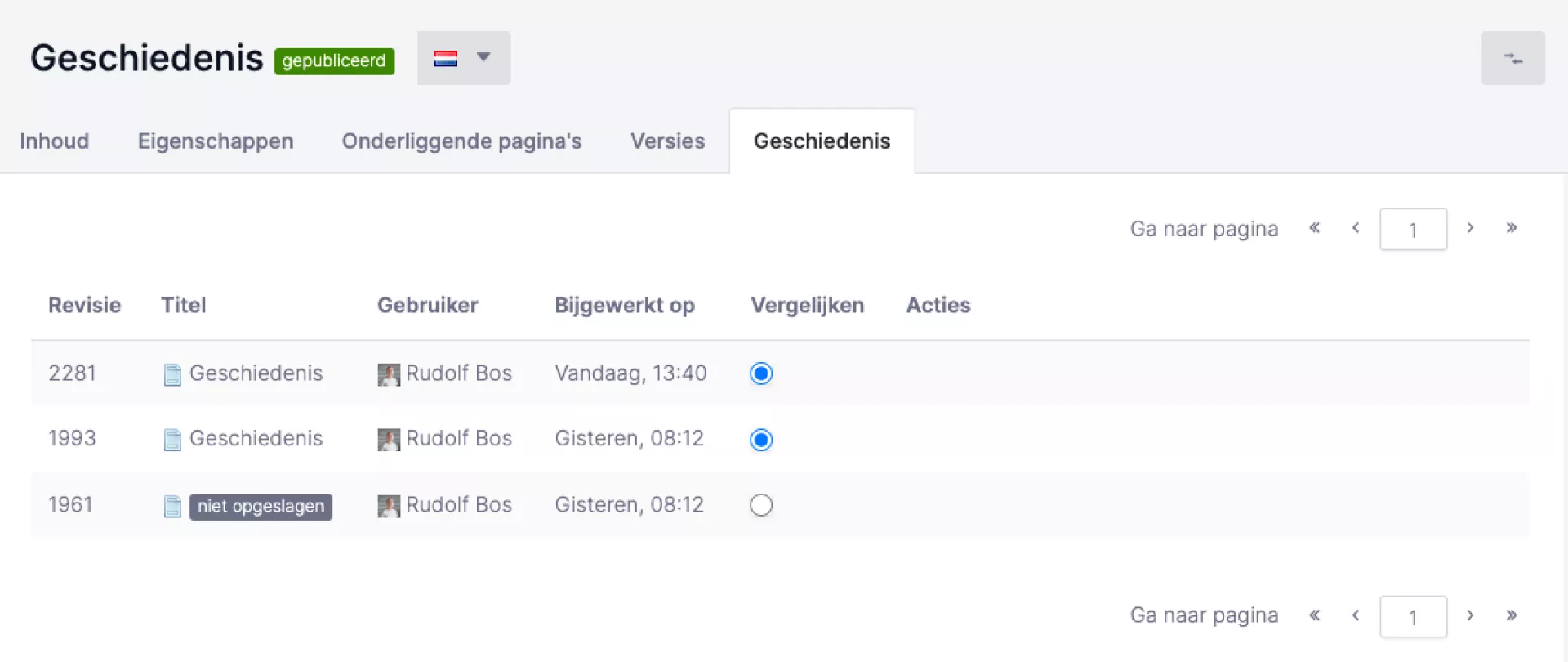
In the overview, you can immediately see who made a modification to the page at what time. But who has done what? To see that, use the "Compare with previous" and "Compare with current" buttons under the actions heading. In the image above, you can see that there are three versions of the page in the history. To see which changes were made last, use the "Compare with current" button.
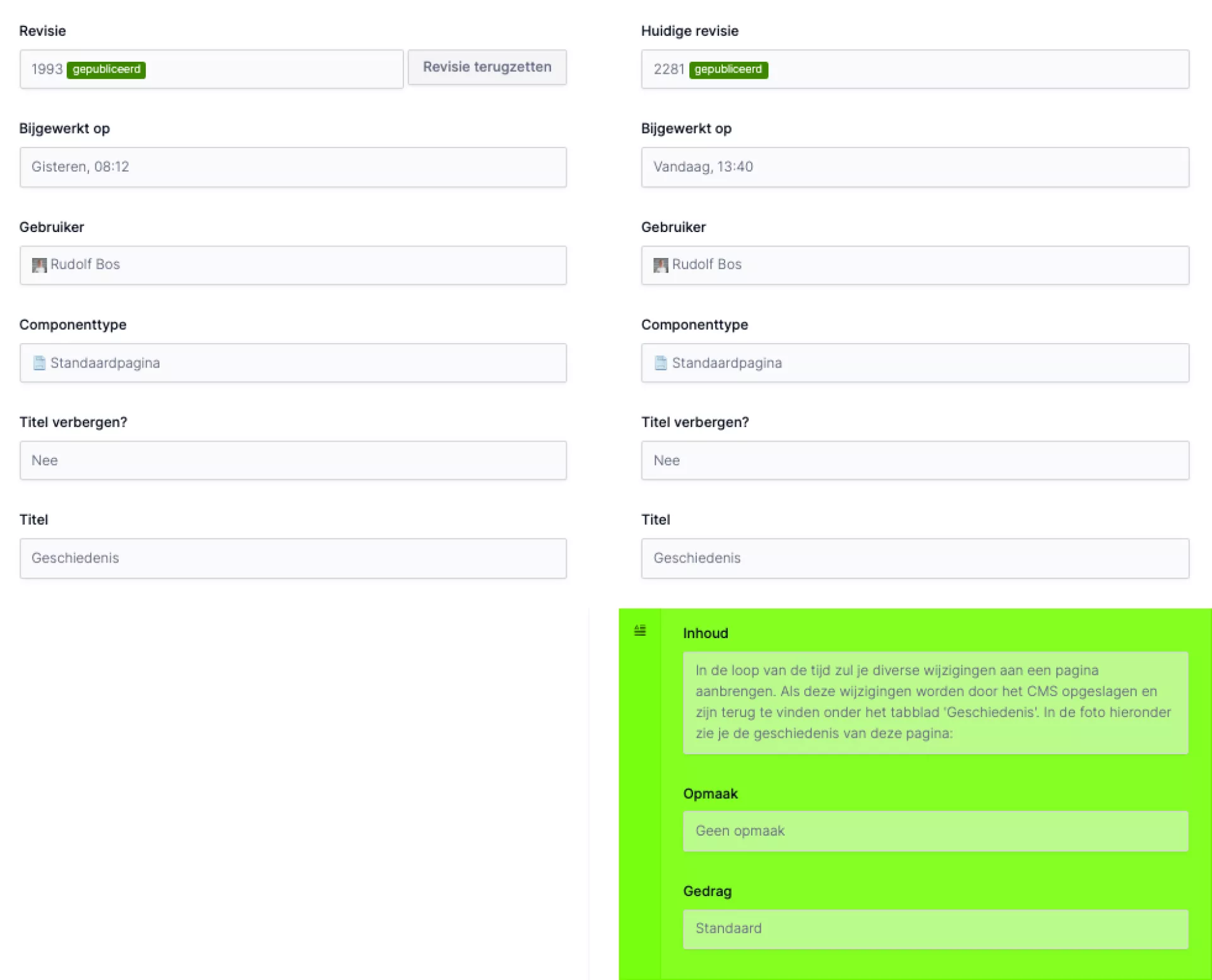
The latest version is shown in the left-hand column. On the right, you can see the changes made afterwards. On the left-hand side, you can see that there is nothing under "Content". On the right-hand side, you can see that there is a paragraph under "Content" and that field is green. This overview shows that a change has taken place under "Content".
- When a component is added, this component gets a green background on the right-hand side, as in the example above.
- When a component is deleted, it gets a red background on the left.
- Have you modified any part of the text, the old text is highlighted in red in the left-hand column and green in the right-hand column.
If you want to undo the new changes, choose the "Restore revision" option.