Image
It is possible to add an image in a Paragraph component. However, it is advisable to add an image via the "Image" component because:
- Images scale better this way, which is important when your website is visited via both desktop and mobile devices. This is because an image can fold above/below a paragraph on mobile this way, which improves readability.
- When you load images this way, the size is resized to the desired size. That means this can save a lot of data traffic for your visitors, as well as the limits of your hosting package. Moreover, it also improves your score in Google PageSpeed Insights.
- The CMS tries to register the use of images, so you know which image is used on which page. It only works if you add them this way.
- You can also add alternative text in the Image component for screen readers. This benefits the accessibility of your website.
Image comparator
Want to show your visitor at a glance the difference between an old and new situation? Then use the feature image comparator. You fill in two images and the visitor can use a slider to compare the difference.
Standardly, the images are displayed horizontally in relation to each other. This can also be shown vertically with a checkbox in the CMS. A checkbox is also available to indicate that the images are light. This makes the drag bar appear darker.
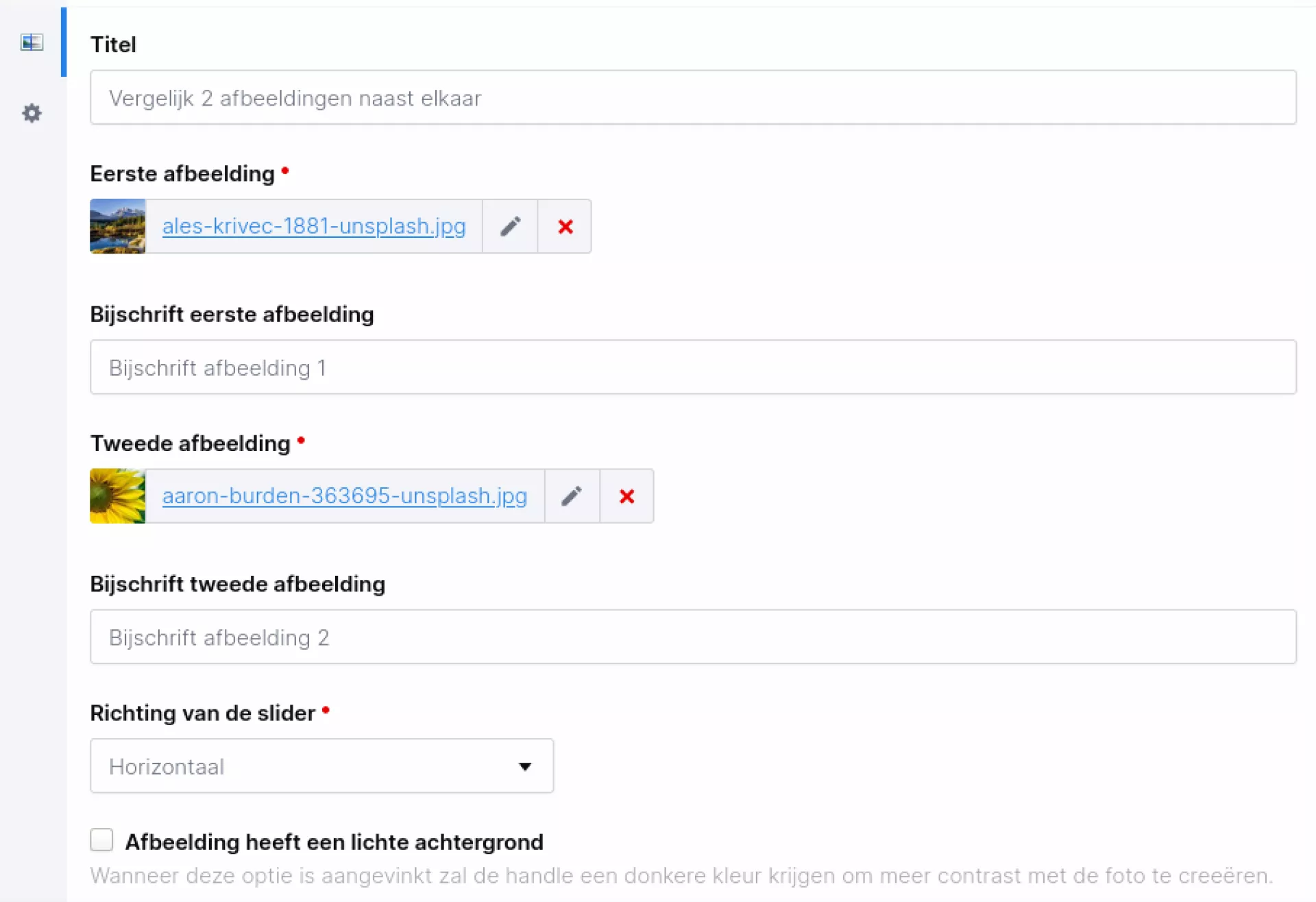
Want to know what this looks like? Then visit https://www.iwink.nl/modules/afbeeldingvergelijker.
Paragraph
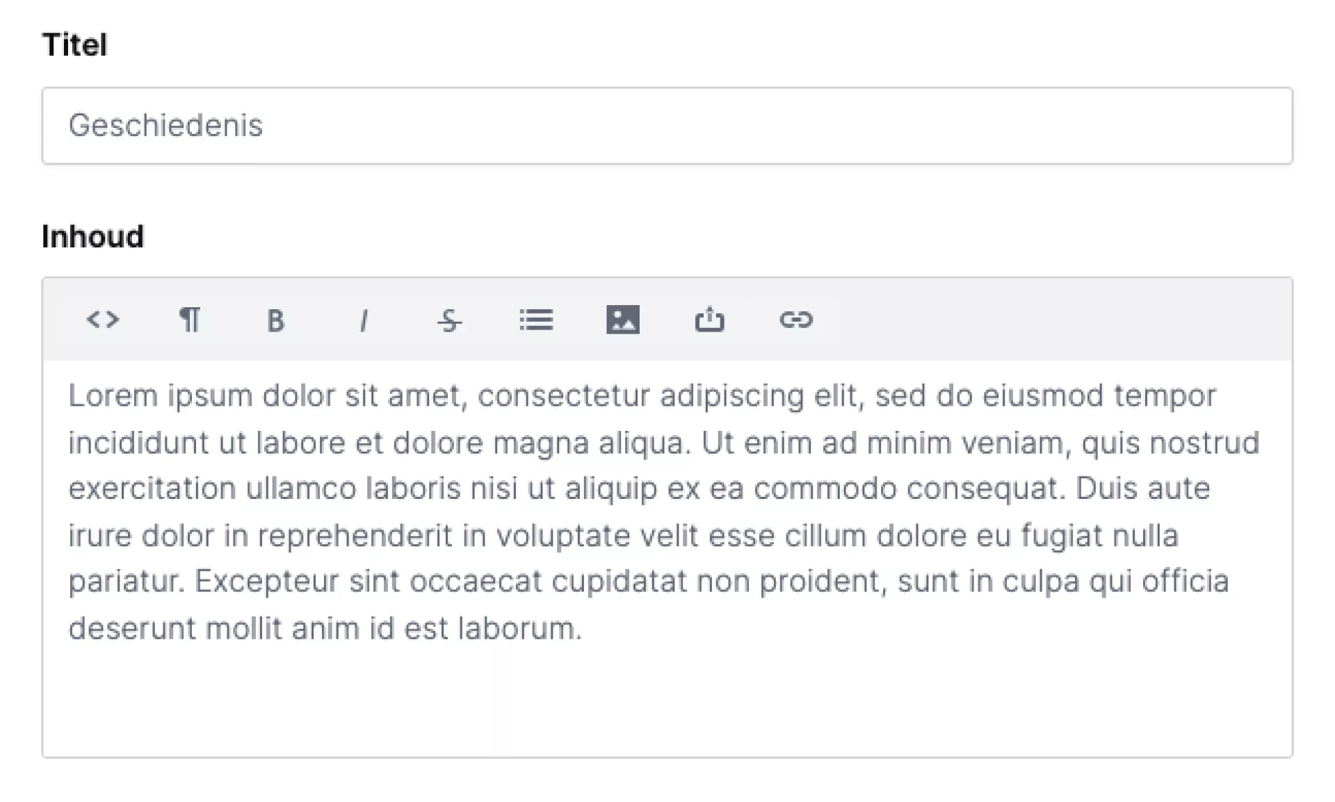
Paragraph with title
This component you will probably use the most on your website and is also available by default. You use this component to add text to your website. A paragraph component consists of a title field and a text field. By default, the title you enter is displayed as an H2 header. The settings for H2 headings (font, colour and font size) depend on the design of your website.
WYSIWYG editor
Depending on your installation, you may have more or fewer settings in a paragraph in terms of formatting. The most common settings are explained below.
- HTML: View the source of the paragraph in HTML code.
- Format: Here you can display text as normal text, as a header or as a sub- or superscript.
- Bold: The text is displayed in bold.
- Cursive: The text is displayed in italics.
- Strikethrough: Text will be displayed in strikethrough.
- Lists: Create lists. You can display these as bullets or with numbers.
- Image: Upload an image from media management.
- File: Upload a file from media management.
- Link: Adding a link requires some additional explanation, which you will find below.
Add (and remove) link
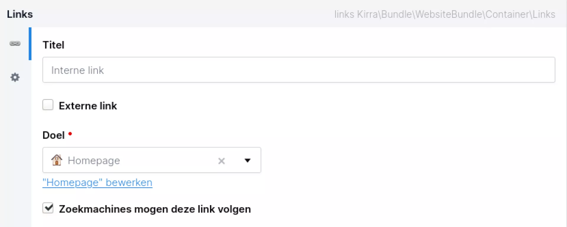
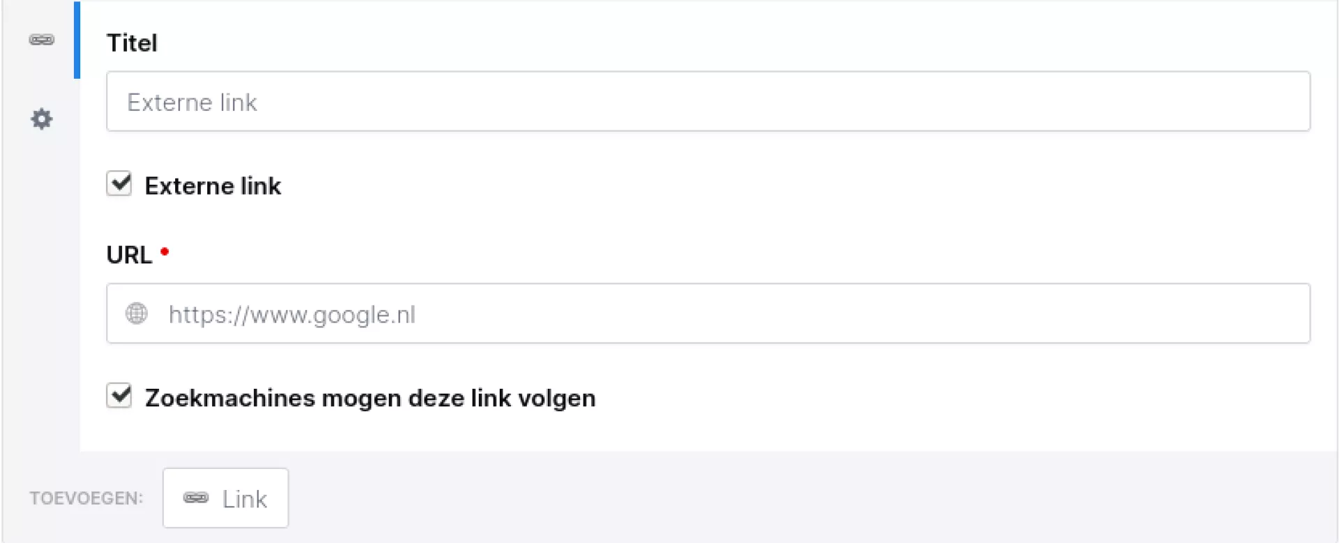
In the 'insert/modify link' field you will find 3 tabs for 3 different types of links you can add: external link, internal link and email. You can use the 'internal link' tab to select a link to another page within your website. The advantage of this function is that when you move the page (and thus change the url), you don't have to change the link in your text.
For the references to a url outside your own website, use the external link tab.
In the 'e-mail' tab, you can enter an e-mail address and also optionally enter the subject and content of an e-mail. When a user clicks this link, their mail programme opens and a new e-mail is created with the e-mail address, subject and possibly the text already filled in. This is useful when users need to send an e-mail to register for an event. In the subject line, you can enter the name and date of that event.
Copy from Word
Many people first type their text in Word and then paste it into the CMS. Unfortunately, this does not always go well, as Word frequently passes HTML code along in the background. This code can then conflict with the code of the website itself, resulting in the text or even the entire page not displaying properly. We recommend entering the text as plain text whenever possible and then doing the formatting via the CMS. If your text needs to be checked by others who do not have access to the CMS, it is best to do this via a TXT file.
Tip!
The following keys allow you to paste without formatting. Useful for when you want to display formatted text from Word without formatting, for example.
- Windows: "CTRL+SHIFT+V"
- MacOS: "CMD+SHIFT+V"
Call-to-action
The Call-to-action component is designed to prompt your website visitor to take an action. For example, filling in a form or viewing another page within or outside your website.
The button comes in 2 variants: primary and secondary. It takes on the colours of the website house style and can be customised by us. If you want a customisation, please contact us!
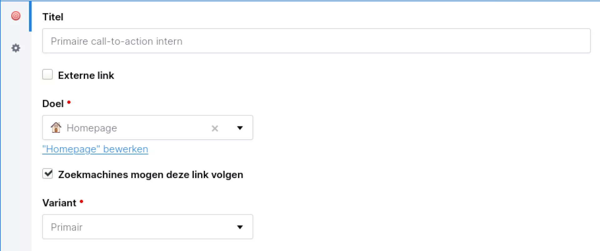
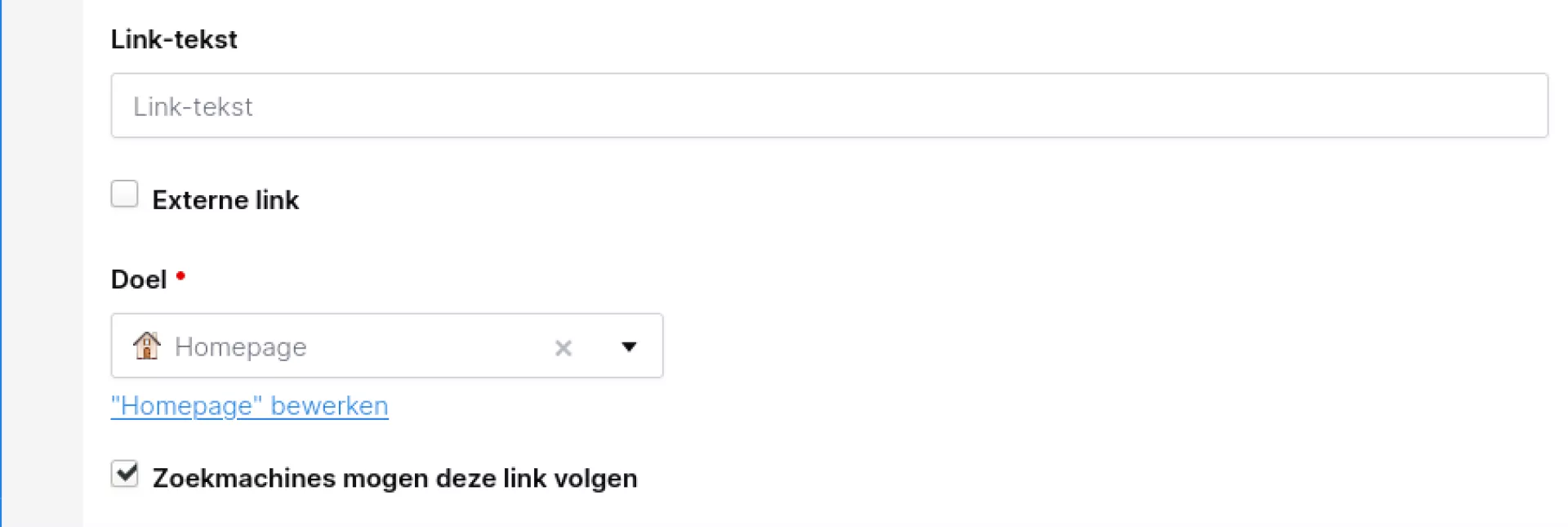
To create a button that leads to an internal page (a page within your own website), you can open the menu under "Target". You can then choose from all the pages on your website here.
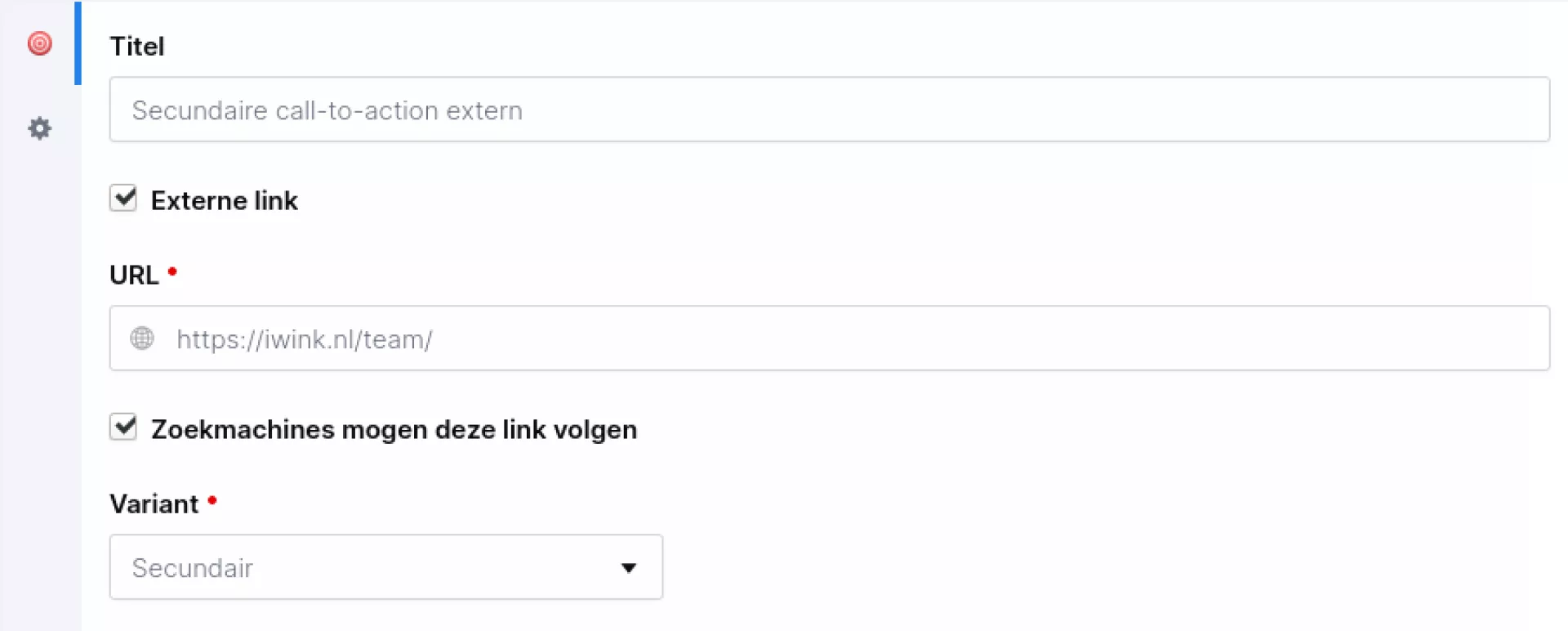
To create a button that leads to an external page (a page of another website), you can check "External link". An input field will now appear, where you can enter the link to the external page.
Call to action +
Call-to-action +
The Call-to-action + component is an extension of the normal call-to-action component. It has additional capabilities to add share buttons and show feedback buttons. These buttons can be used to ask a user what they think of the information on a page.
The feedback buttons have data attributes, so the clicks can be registered with Google Tag Manager. Should you want to make use of this, we still need to set it up for you. In that case, we need a Google Tag Manager API key from you. More information about Google Tag Manager can be found on this page.
The colours of the buttons are taken from your house style. If you would like to change anything in this, please contact our support department.
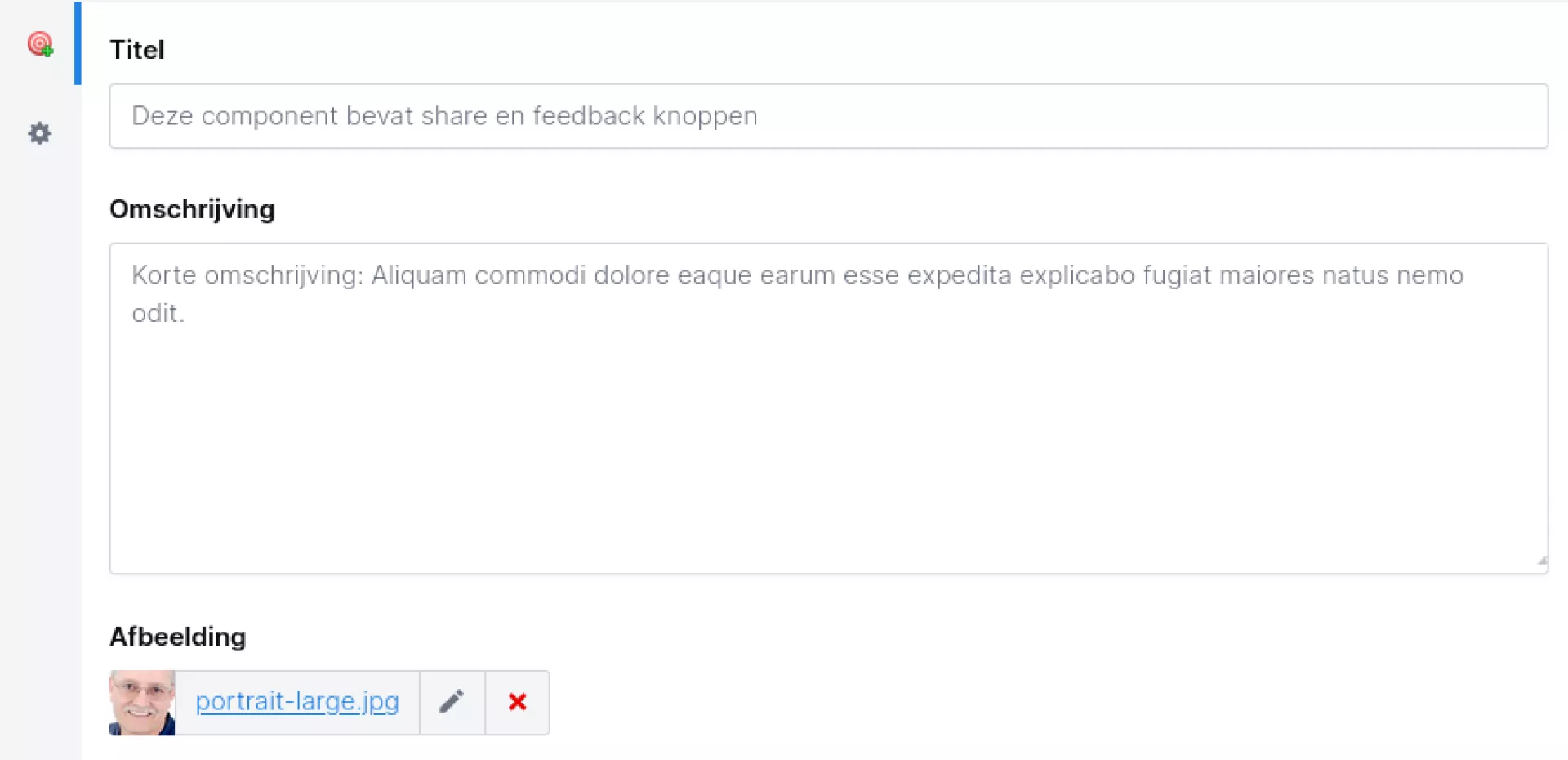
The extended version of the call-to-action component looks more like a 'normal' paragraph, containing a button. You therefore have more options. For instance, you can add a title and write a description of what the button does. You can also include an image.
For the actual button, you can decide what the text will be. In addition, you can specify whether it is an internal link (i.e. within the website) or an external link (i.e. to another website).
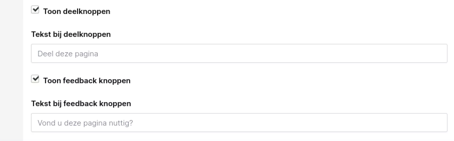
Last of all, you can display share buttons (sharing via social media) and feedback buttons. As mentioned earlier, the feedback buttons come with data attributes that you can find in your Google Tag Manager.
Call to action group
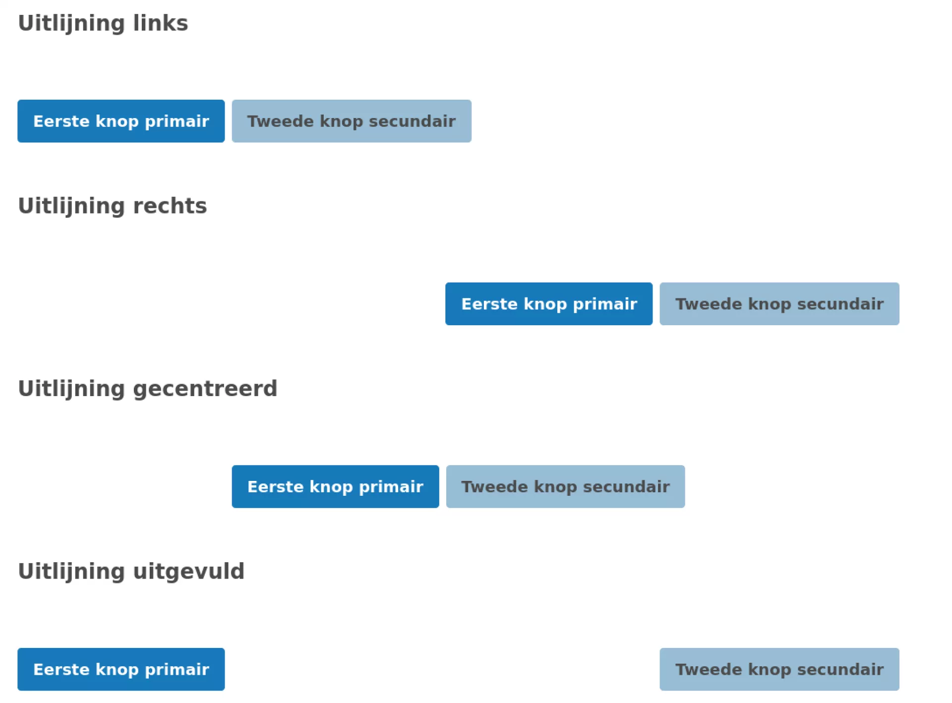
This component allows you to join and align multiple buttons together. The alignment options are "None", "Left", "Right", "Centred" and "Blanked out".
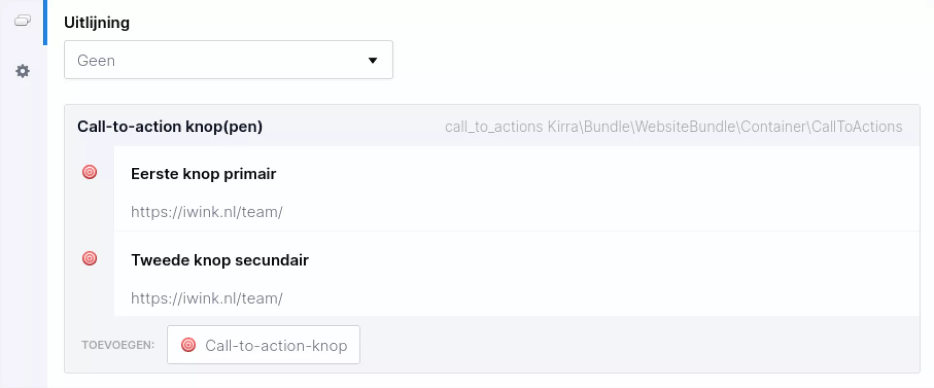
Under "Alignment" you can choose which alignment you want. Below that, you can then add the call-to-action buttons. You can set these as a normal call-to-action button, like explained here.
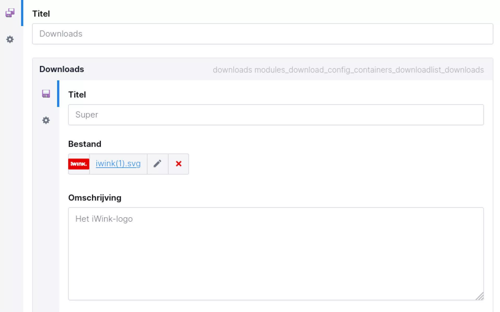
Downloads
This component allows you to add a single download link or a list of downloadable files to a page. Each download features information about the type of file in the form of an icon. In addition, you can also add a description.
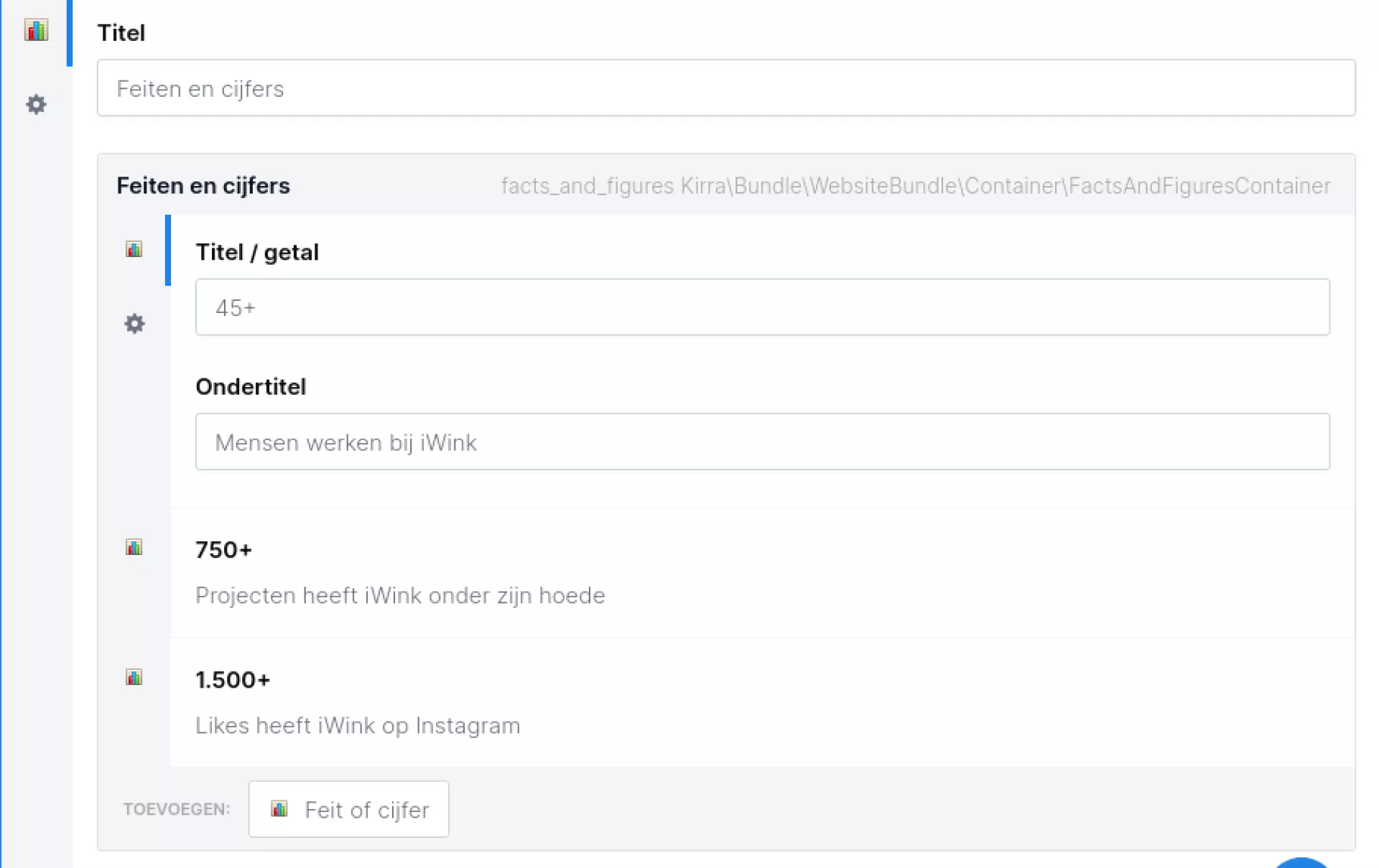
Facts & figures
The facts and figures component actually consists of two components:
- Facts and figures:
- Contains a field for the title.
- Contains a container to which "Fact or figure" components can be added.
- Fact or figure:
- Contains a field for the title/number.
- Contains a field for the subtitle.
Form-reference
The name actually says it all; a reference to a form. This component reserves a place on the page for a form.
Tip!
In a form reference, you can also put an introduction. This text is loaded above the form so you can tell a visitor more about the form. This introduction disappears as soon as someone fills in the form. So that differs from a normal paragraph that you would put above the form-reference (because, it just stays there after submission).
More information on how forms work can be found at the Forms module.
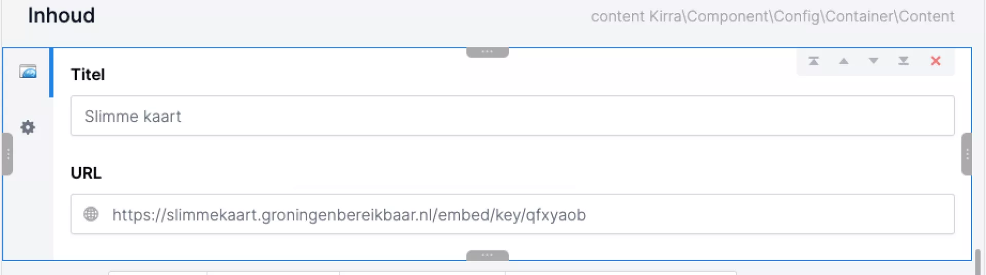
Iframe
An iframe allows you to load another website or an application from an external website onto a page. For example, an interactive map, a video, a (job application) form or an online brochure will reserve a 'frame' on the page in which a web page or application is loaded.
If you want to load an application, you will often be supplied with an iframe url or script for this purpose. This always starts with <iframe> and ends with </iframe>. In between is the information needed to load the iframe correctly. An iframe url can look like this:
<iframe width="100%" height="750" frameBorder="0" scrolling="no" marginheight="0" marginwidth="0" src="https://slimmekaart.groningenbereikbaar.nl/embed/key/lcelkfe"></iframe>
You can transfer this information into the iframe component.
In the 'url' field, enter the url of the item to be loaded. You get the url from the iframe url. It is the url you see behind "src=".
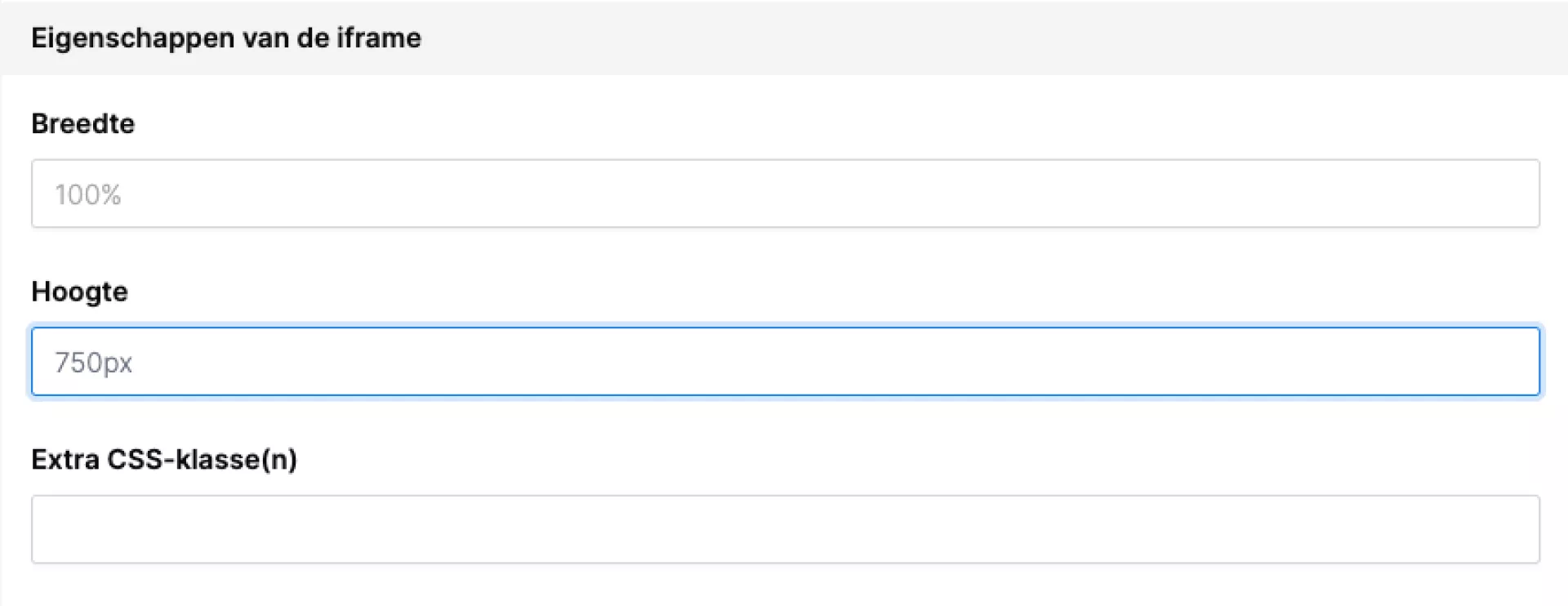
Then go to the properties of this component (via the icon with the cogwheel on the left side of this component). Here you can enter a number of other properties:
Width: this is set to 100% by default. It is advisable to leave it like this, so that the iframe is displayed neatly.
Height: specify the height in pixels. Sometimes the height is already in the supplied iframe url, like in the example above (height="750"). If it is not in the url, try different values yourself. If you give the iframe too little space (i.e. the height you specify is lower than the height the frame needs), the iframe will get a scroll bar. When you no longer get a scroll bar, you know the height is right.
Further, you can add additional CSS classes. Usually this is not necessary, but the creator of your application may offer extra CSS options. You can then enter these in the 'extra css classes' field.
Please note: Some websites have built-in security that prevents them from being loaded as an iframe on another website. All websites built by iWink have this security. So it is not possible to load your website into another website via an iframe.
List of links
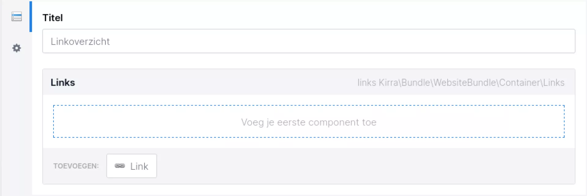
This component allows you to create a handy list of links. You can give this list a title and then add the links. These can be both internal links (within your own website) and external links (other websites).
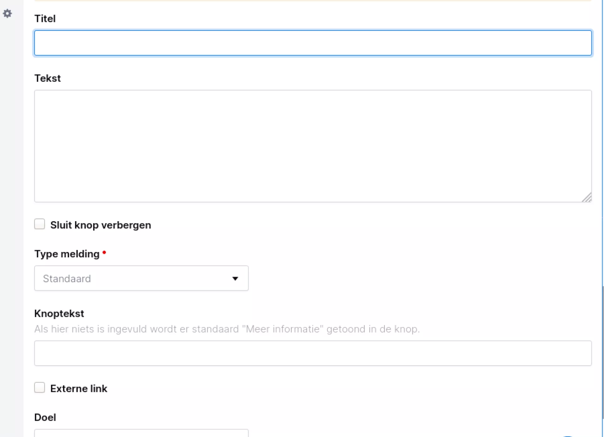
Notification
This component is available as a container component. Here you can enter a title and a text. In addition, you also have the option of hiding the close button so that a notification cannot be clicked away and always remains there.
A number of display options are also available, depending on the type of notification:
- Standard (house style colour)
- Criticism
- Warning
- Informative
- Success
The background colour will adjust according to the type. The text colour will then be set to white or the body text colour. This depends on which colour has more contrast with the background colour of the notification.
Is the close button visible and do you close the notification? Then it will obviously no longer be shown when you click the notification away.
Youtube
Using YouTube components (instead of the so-called embed code from YouTube itself) gives you more control over your videos. It ensures that all videos look the same, as you can set the display yourself across the entire website. Still, you also have the freedom to deviate from your own default, should that just look nicer on the page.
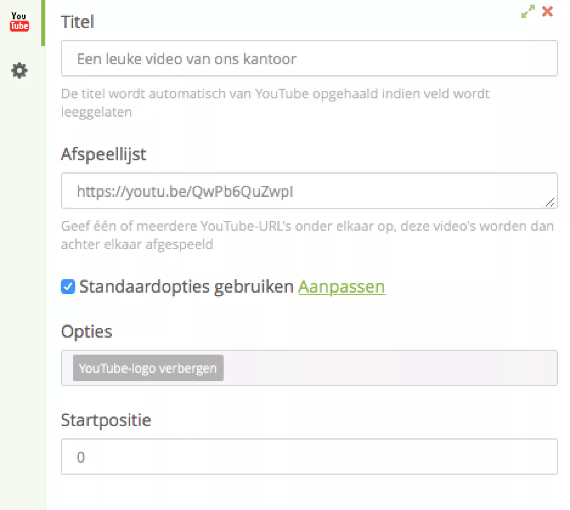
A YouTube component displays a YouTube video on the page. You can set several options for this:
- A title
- One or more links to your YouTube video
- Take over standard settings (read more at the YouTube module)
- Options: for when you want to deviate from the default settings
- Start position in seconds